Xpression of colours, printed right.
A press in Rajkot handling everything from brochures to corporate packaging — four colours checked by eye before a single sheet leaves the floor.
print & packaging formats, one shop
colours checked in-house, every run
Rajkot floor, quick pickup & delivery
WHAT WE PRINT
Sixteen kinds of print. One press floor.
WHY XPRESS
Priced fair, checked twice, run on time.
"Quality is not an act, it is a habit." — a line we've printed on our own wall for years.
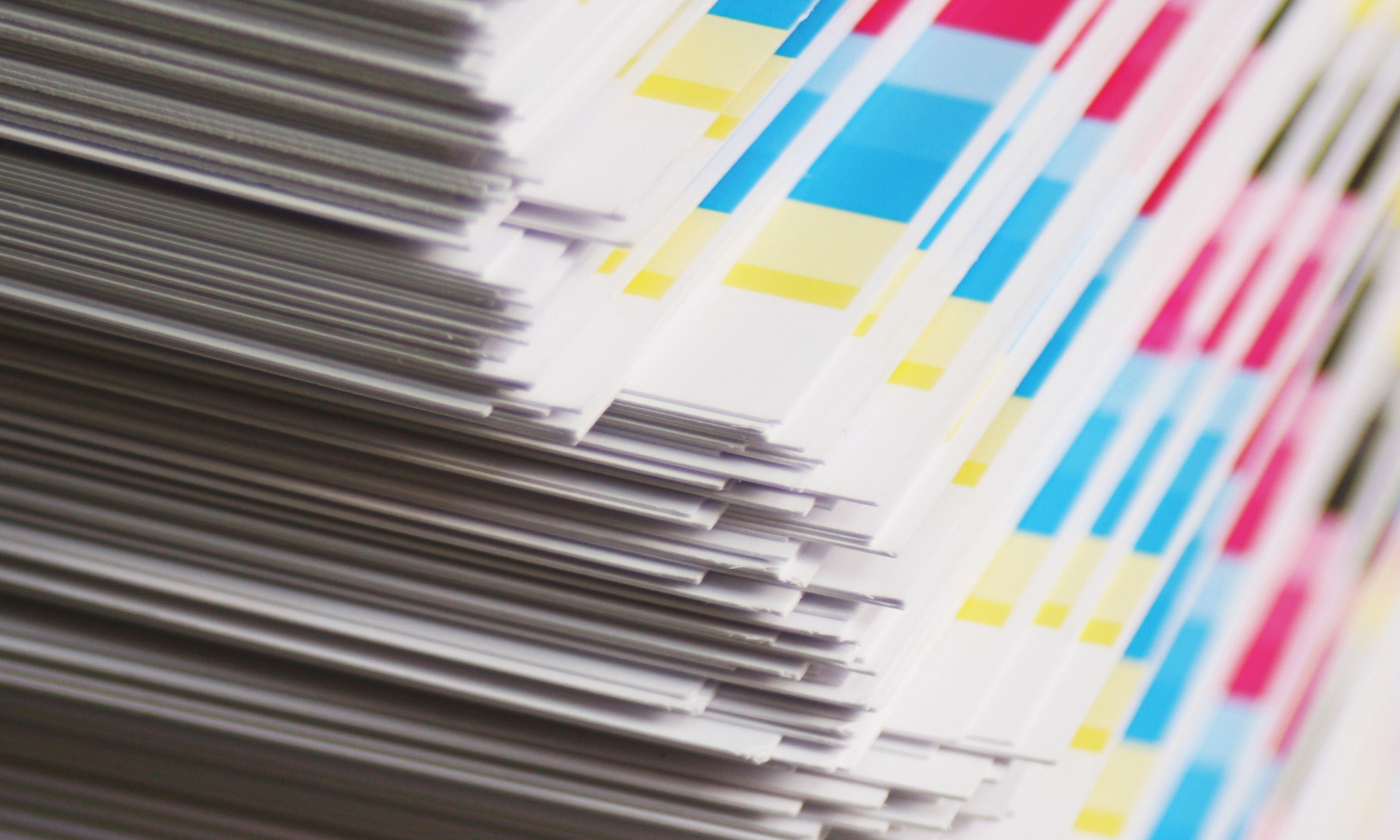
Priced to keep you printing
Competitive offset rates that make repeat runs affordable, not painful.
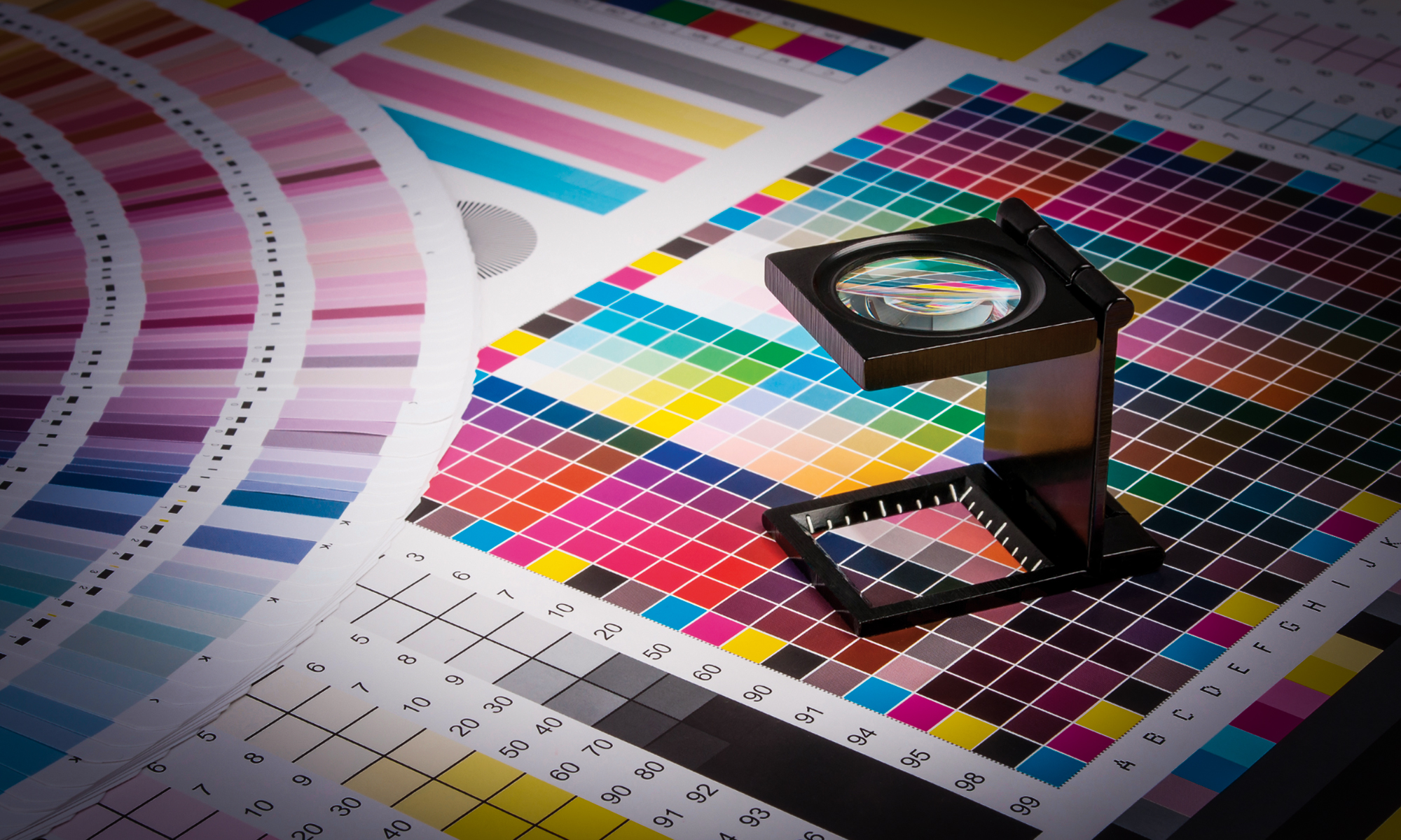
Checked before it ships
Every plate matched against the swatch book, every sheet checked under the loupe.
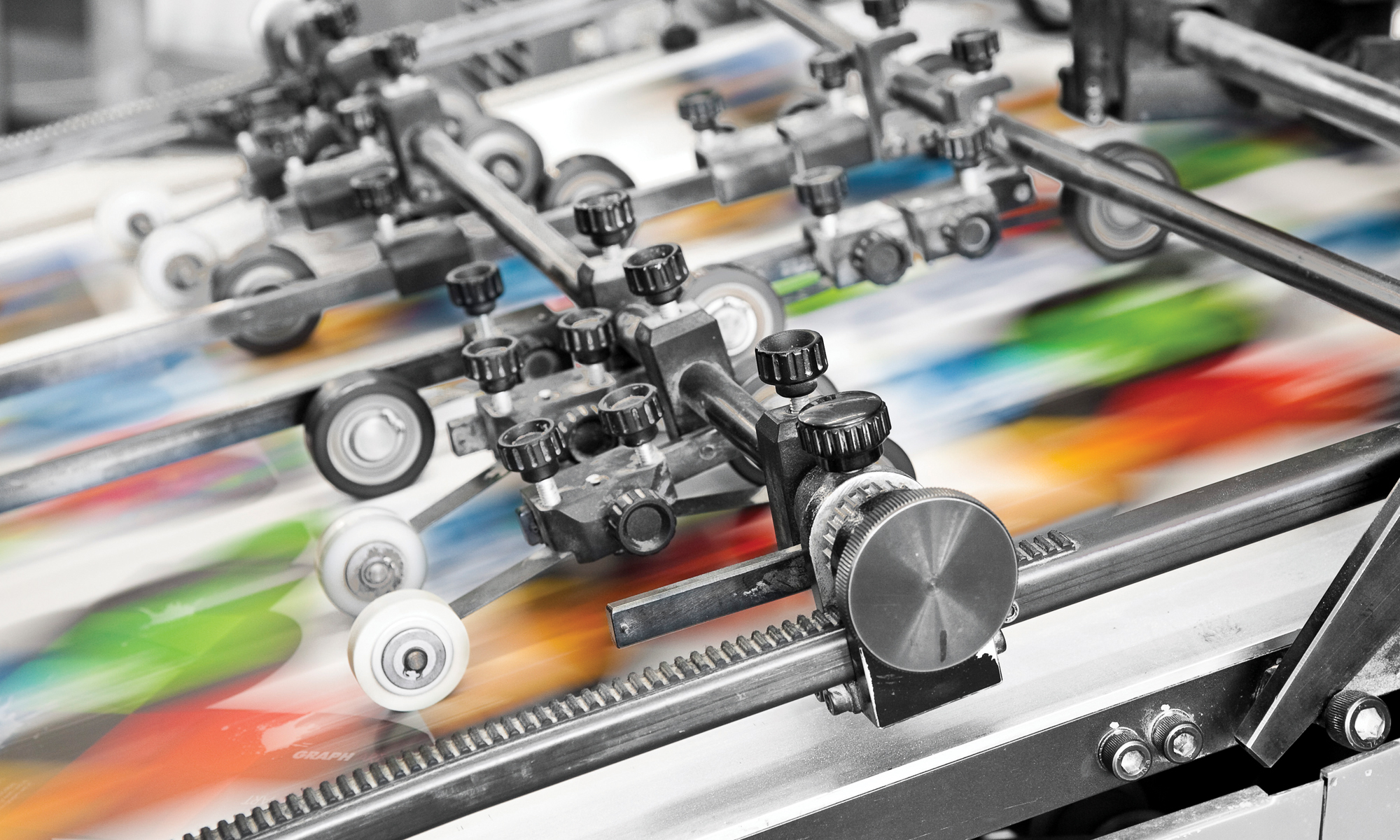
Fast, without cutting corners
Presses that run daily, so your brochure isn't stuck behind someone else's job.
INSIDE THE PRESS
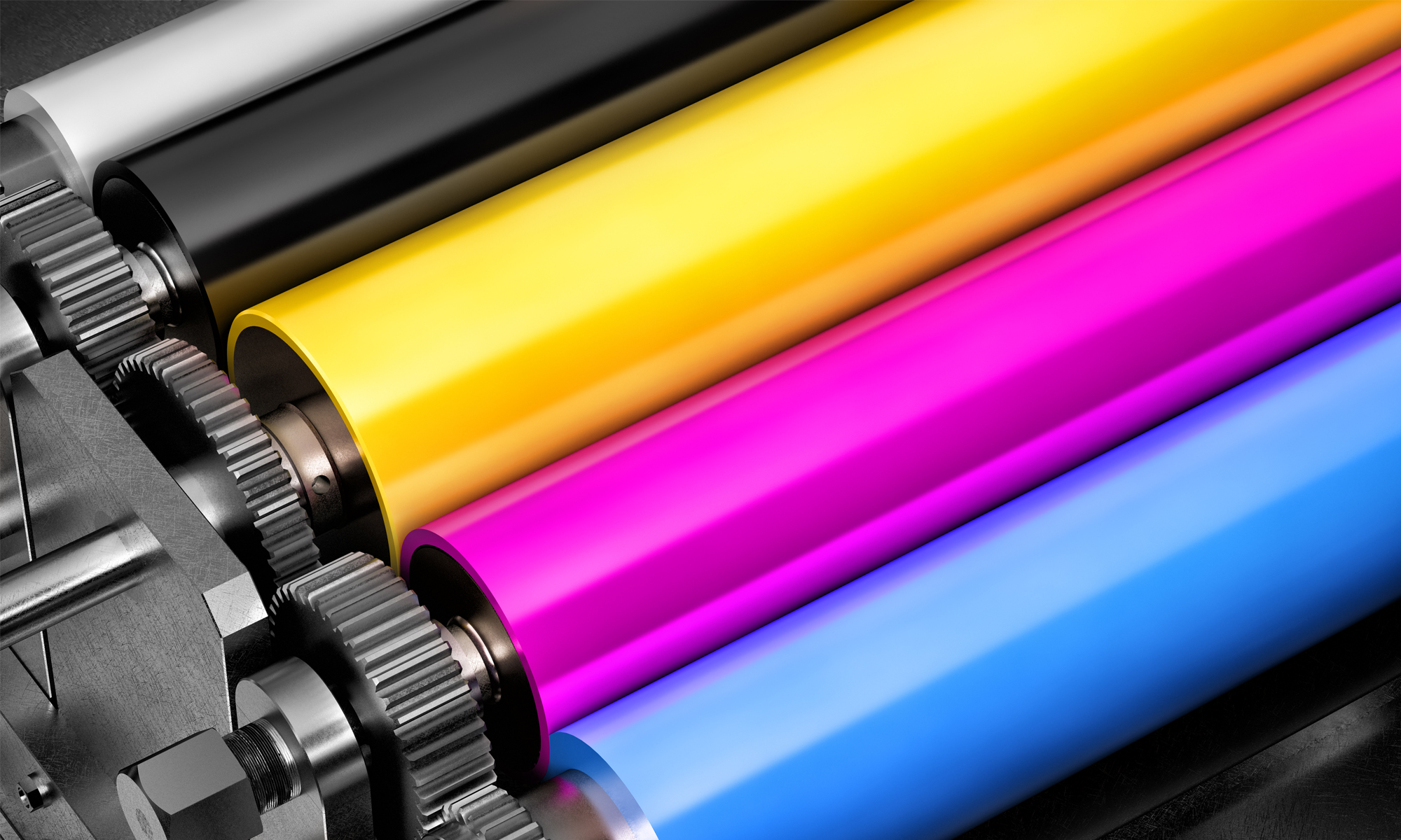
Five colour stations, run daily.
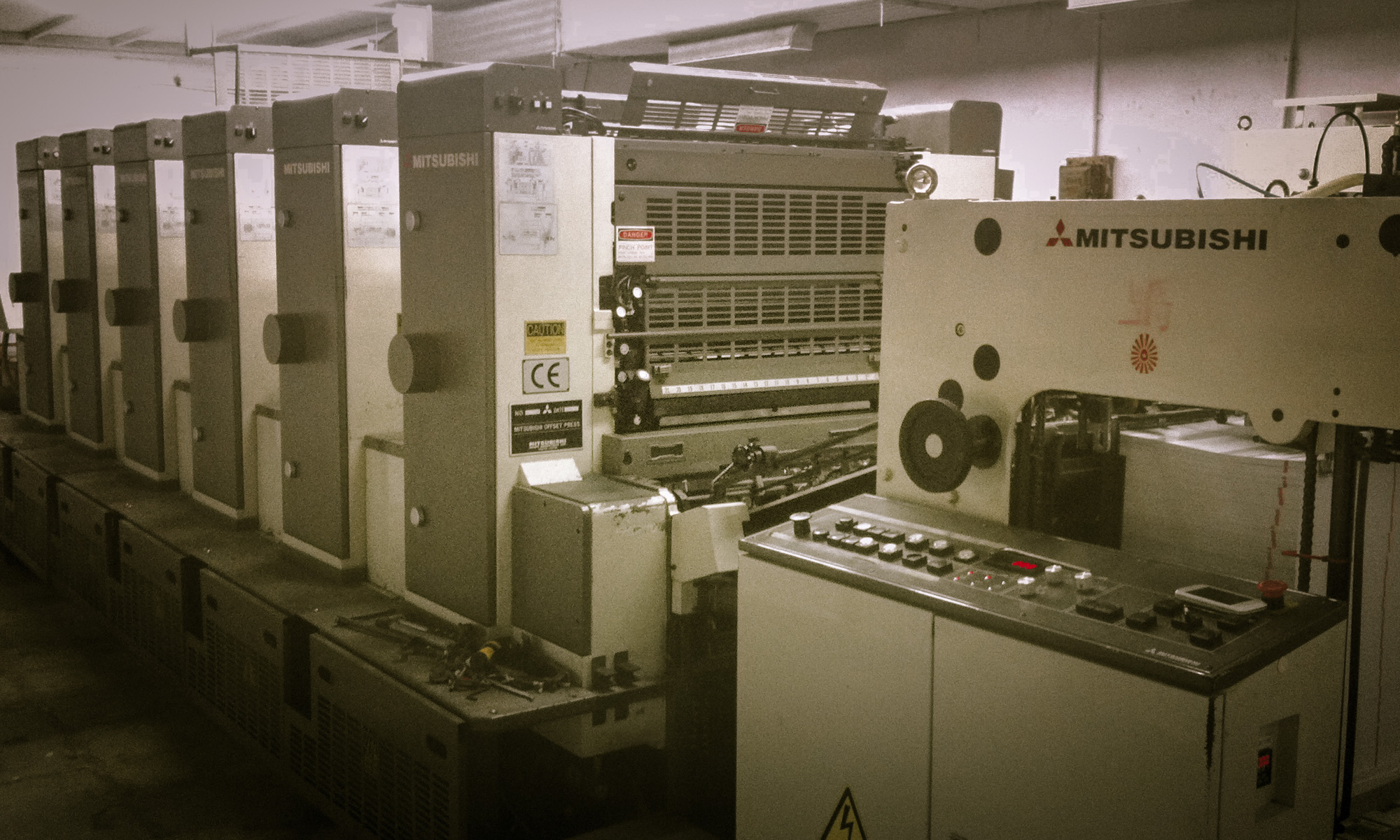
Our Mitsubishi offset press sits on the Rajkot floor and runs five colour stations at once — enough control to hold a Pantone match across a long packaging run, or turn a short leaflet job same week.
GALLERY
Work off our floor.
Jobs we have printed and packed. Hover any picture to see it in full colour.
KNOWLEDGE
What to keep in mind before your job goes on press.
Notes we share with clients and their designers. Most reprints we see come from something on this list, not from the press.
Preparing artwork
- Keep 3 mm bleed on every edge, and hold text and logos 5 mm inside the trim.
- Send a press-ready PDF with fonts embedded or converted to outlines.
- Images at 300 dpi at final printed size; line art and barcodes higher.
- Convert RGB artwork to CMYK before you export, so you see the shift on your screen and not on the sheet.
Colour and light
- The same sheet reads differently under daylight, tube light and LED. Judge colour under one standard light, not three.
- Two inks that match under one light can drift apart under another — worth knowing when a carton and its insert are printed on different stocks.
- Use rich black for large solid areas and single black for small text, so fine type stays sharp.
- A monitor is a guide. When colour is critical, ask us for a proof off the press.
Substrate
- Coated stock holds ink on the surface — colour reads denser and detail stays crisp.
- Uncoated stock absorbs ink, so expect some dot gain and a softer, lighter result.
- Board and kraft carry their own colour; the paper is part of the mix, not a blank white.
- Finishing changes appearance: matt lamination drops density, gloss and UV lift it.
Environment and handling
- Paper takes on moisture. Keep stock and finished work flat, wrapped, and off the floor.
- Let sheets settle before folding or die-cutting — it keeps folds from cracking along heavy ink.
- Fresh ink needs time to set. Stacking a run too high too soon can mark the sheet below.
- Store away from direct sunlight. Reds and fluorescents fade first.
Die-lines
- Keep the die-line on its own layer as a spot colour set to overprint, never as part of the artwork.
- Mark cut, crease and perforation distinctly — a crease drawn as a cut becomes a cut on the sheet.
- Extend background colour 3 mm past every cut edge, including glue flaps and tuck-ins.
- Send the die-line as vector at 100% scale. Scaled or traced outlines drift from the tool.
Packaging structure
- Tell us the product weight and how the cartons will be stacked before the board is chosen.
- Grain direction runs along the crease — across it, the fold cracks and the box loses stiffness.
- Board caliper changes the flat size. Fix the structure first, then lay artwork on it.
- Ask for a plain mock-up on the actual board and pack your product into it before we print.
Pantone matching
- Name the Pantone number in the file and keep it as a spot channel, not converted to CMYK.
- Quote the coated or uncoated reference that matches your stock — the same number prints differently on each.
- Some Pantones cannot be reproduced in four colours. If the run is CMYK-only, we will show you how close it lands.
- Judge against a current swatch book. Fans fade with age and light, and an old one moves the target.
Send the die-line and the Pantone list with your first file.
It saves a round of proofs on almost every packaging job.
WhatsApp UsNot sure about a file? Send it across at {{ email }} — we check artwork before plating and tell you what to fix.
GET IN TOUCH
Let's print something good.
Call or WhatsApp Bhavin directly — we'll get back with a quote the same day.
XPRESS
Lohanagar Street No.1, Gondal Road, Rajkot 360002, Gujarat (INDIA)